Colors
Color distinguishes our brand and helps us create consistent experiences across products.
Primary Colors
Colors that represent our brand, used as primary color and accents. Our primary palette is comprised of purple, white, and blue to bring boldness to our brand and is used in logical ways throughout product and marketing to guide the eye and highlight the important bits.
Secondary Color
Our secondary palette contains a variety of colors to keep things fresh and interesting. The secondary palette consists of red, green, orange, and yellow. These colors are used across all web apps at DreamHost.
Gray Scale
Our neutral palette is a set of warm grays. Use these to enhance information especially in the UI, but also ask if gray is even necessary for larger areas. The grayscales also are used for the backgrounds and text color.
Example
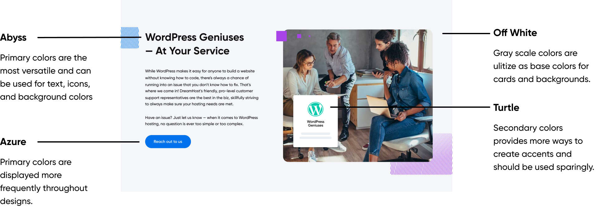
In this example, we break down the usage of primary colors, secondary colors, and gray scale colors.
Color Usage
Contrast
Color contrast between text and background is important because it affects people’s ability to percieve information and is neccessary for user accessibility. Color combonations should have a color contrast ratio of above 3.0.
Why DreamHost
Own your virtual presence with the power of DreamHost. With 1.5 million websites already under our care, we’re ready to help you and your sites find success online.
Pass
White on Abyss
Why DreamHost
Own your virtual presence with the power of DreamHost. With 1.5 million websites already under our care, we’re ready to help you and your sites find success online.
Pass
White on Azure
Why DreamHost
Own your virtual presence with the power of DreamHost. With 1.5 million websites already under our care, we’re ready to help you and your sites find success online.
Pass
Abyss on White
Why DreamHost
Own your virtual presence with the power of DreamHost. With 1.5 million websites already under our care, we’re ready to help you and your sites find success online.
Fail
Smoke on White
Why DreamHost
Own your virtual presence with the power of DreamHost. With 1.5 million websites already under our care, we’re ready to help you and your sites find success online.
Fail
Galactic on Metal
Why DreamHost
Own your virtual presence with the power of DreamHost. With 1.5 million websites already under our care, we’re ready to help you and your sites find success online.
Fail
Coral on Sunflower
Create Emphasis
When used sparingly, color can be used to bring attention to important messaging

Do
Use color to emphaize main points and attract attention.

Don't
Don’t use overly distracting color combinations.
Evoke Feelings
Colors have meanings and connotations. Below are feelings associated with different colors.
Blues & Purples - Calm, loyalty, trust
Greens - Nature, renewal, growth
Yellows & Oranges - Happiness, creative, cheerful
Reds - Danger, warning, passion

Do
Do use color combinations such as blues and yellow to communicate a pleasant tone.

Don't
Don’t overuse aggressive colors such as red because it can be perceived negatively.