Photography
Imagery is a brand’s visual language. It helps tell a story, clarify complex messages that are difficult to express with words, and to show users how to perform an action. Find photography assets here.
Overview
Photography is used as a glimpse into what it is to be human. It’s a way of showing customers that we know that life is more than just work. Behind everyone’s website is a person and we want our customers to know that we are people too. With wants, needs, and feelings.
They should not be distracting but add to the overall design, and feel. They should guide, and invoke feelings rather than halt and be scrutinized.
Photography at DreamHost should feel organic, obtainable, and above all, authentic. We want to give customers a window into not only the life they have, but the things they want to achieve. Showing them the potential of what hosting a site can help them obtain. Freedom.
General Usage Guidelines
Colors
Colors in photographs should feel natural, and add to the overall design of a page. They should feel like real life.
Do
Select images with contrasting colors that works well together.

Don’t
Don’t select images with unnatural or forced or manipulated coloring.
Lighting
Lighting is very important and can help convey the mood of a photo. Use photos with warm and natural lighting. Be mindful of portions of a photo that may contain over exposure.
Do
Select images with natural lighting.

Don’t
Don’t select images added gradients or lens flare.
Background
Background can give context and add to the story telling. It should be treated just as important as the subject .
Do
Do crop images of excess background objects.

Don’t
Don’t select images with the overuse of background or foreground blur.
Content Seperations
When a photo is next to text be sure that the subject in the image is facing the accompanying text.
Do
Do use imagery of subjects facing the content.

Don’t
Don’t use imagery of subjects with their back facing the content.
Photography Types
People Abstract Landscape Product
People
People are the main focus for our photography. People working, creating, and just living. When it comes to people style there are three main categories, casual, creative, and professional. When choosing a photo the subjects style should be considered. This will convey a particular mood regardless of the background content.
Casual
Casual photos should feel more like everyday life. Take a moment for yourself. Enjoying the downtime. These photos usually will have people sitting on couches or leaning against something to convey the feeling of relaxation. Clothing should be something you might wear every day. Pajamas are ok in the right context but should never feel lazy or unkempt.


Creative
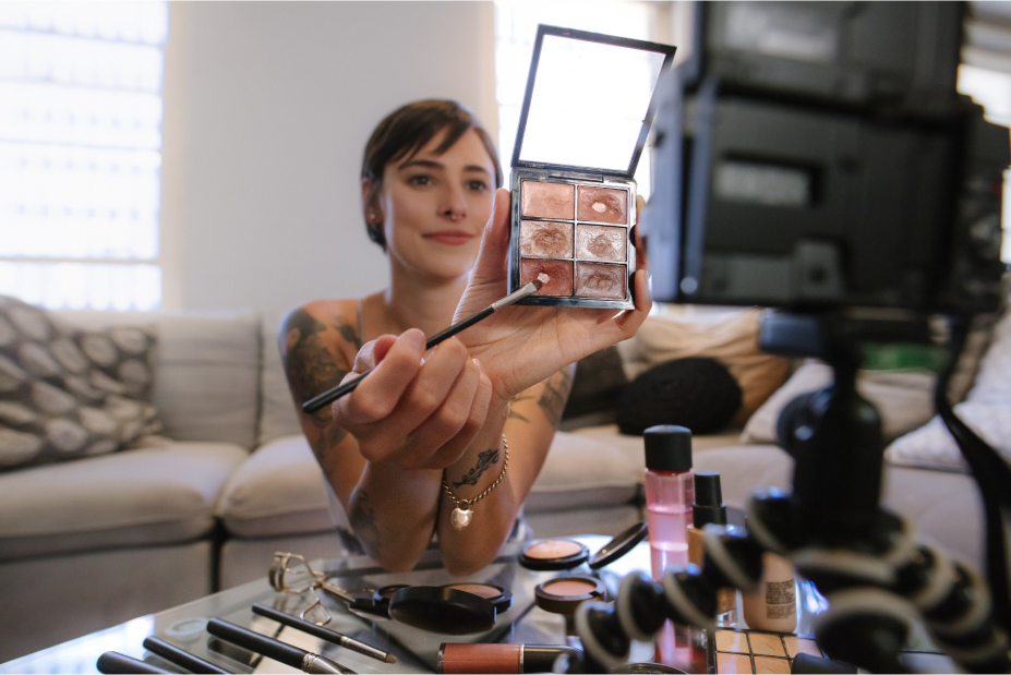
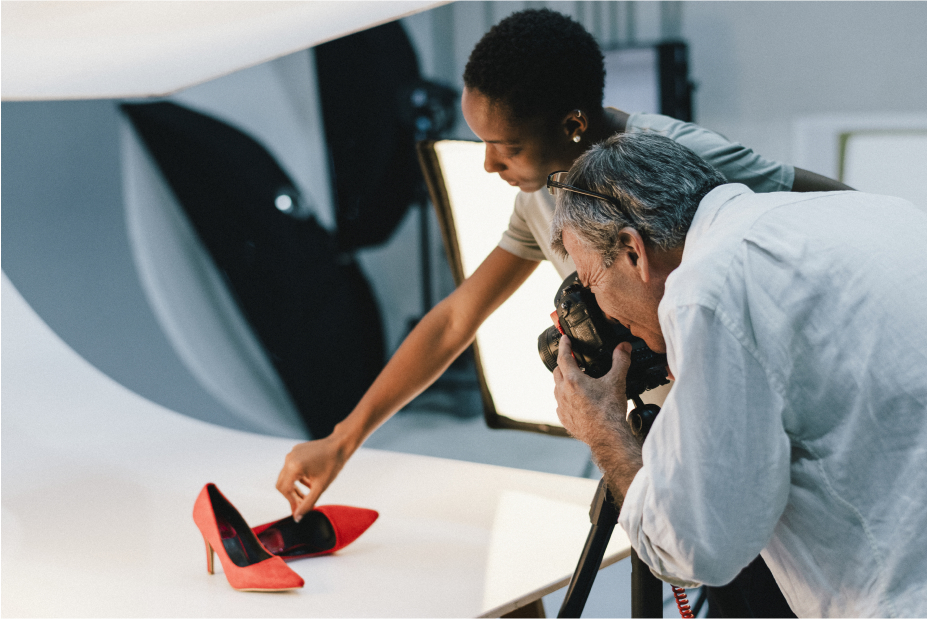
Creative photos should highlight the process of creation. They are a behind-the-scenes look. They should include the tools involved, and can also involve the cameras being used to capture the moment. The workspaces can feel more cluttered, but not chaotic.
Professional
Professional photos should show people in a business-style setting. This could be an office, or even sitting at a desk. The desk objects should feel neat and organized. The clothing should be business casual, but not stuffy.


People Usage Guidelines
Eye Contact
Photos should feel candid. Like taking a picture of a friend. People should never be looking directly at the camera, with one exception: Subjects may be looking directly at the camera in the instance that it’s accompanied by some avenue of help. When people are looking for assistance they want to know that the person on the other side is giving their undivided attention.
Do
Do select images that feels candid and in-the-moment.

Don’t
Other than the exeption, don’t use photography with direct eye contact.
Collaboration
For photos that have multiple people they should be working together, or enjoying each other's company. This is a visual reminder that we are there for them and want to help them have fun, grow their success, but also that we know there’s more to life than just working.
Do
Do select images of engaging team members working together.

Don’t
Don't select images of team members working alone.
Abstract
Abstract photography focuses on color, texture, and/or emotion. These photos are used to add visual flair to make things more natural, and organic, or cause the eye to focus on a particular element.

Abstract Usage Guidelines
Pairing
They can be used to accompany other photography, or used as background textures, and pops of color. When people are used the subject should either be a silhouette or should be the only thing in the picture. The background should be entirely black or white. Abstract images of people are the only type of abstract photo that can be accompanied by a secondary abstract photo, but only one of the pictures can have a person in it.
Do
Do use abstract photos to compliment other photos are primary white or black.

Don’t
Do not pair abstract photos with another colorful photo.
Zoom
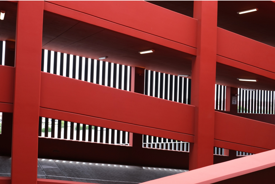
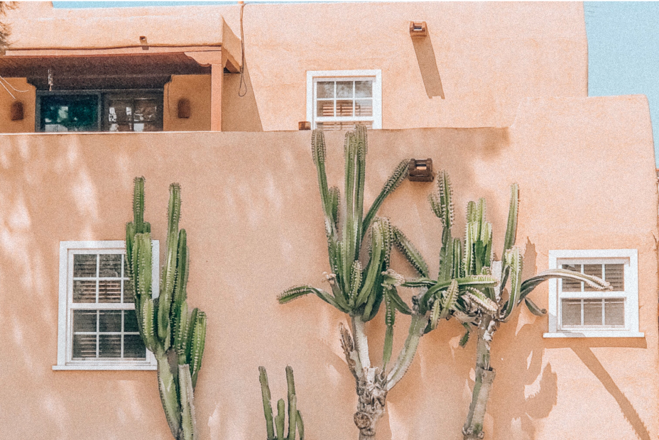
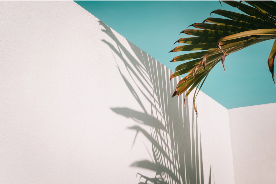
Texture photos are zoomed in photos of real world objects. Such as architecture, leaves, bubbles, products, etc. Things that exist in the real world. They should feel familiar but not be distracting. The natural lines created in these images can also be used as natural section breaks on pages.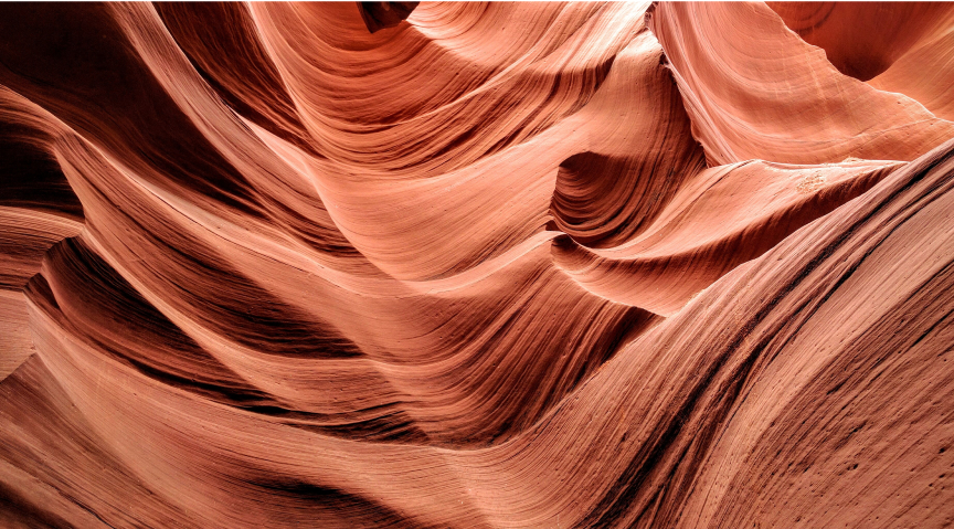
Do
Do zoom ... something here

Don’t
Don’t use distracting and unfamilar photos.
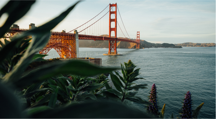
Landscape
Landscape photography can be both places that feel familiar as well as places you’d love to visit. When possible it should be difficult to tell exactly where the photo is from. The goal is to resonate with the world, not a specific region.
Landscape Usage Guidelines
Location
Landscape photography can be both places that feel familiar as well as places you’d love to visit. They convey the freedom of self expression. When possible it should be difficult to tell exactly where the photo is from. Sure, people who know will know, but it shouldn’t be the focus. The goal is to resonate with the world, not a specific region.
Do
Do use locations that would resignate with people from all over.
Don’t
Don’t use easily identifiable locations.
Top Down Perspective
Top down photography focuses more on patterns, and colors. Similar to abstract photography, but should clearly be outdoors and feel expansive. City landscapes should usually be shown as top down photography. Not everyone lives in a big city and the top down perspective focuses less on the tall buildings and more on the patterns and people that live there.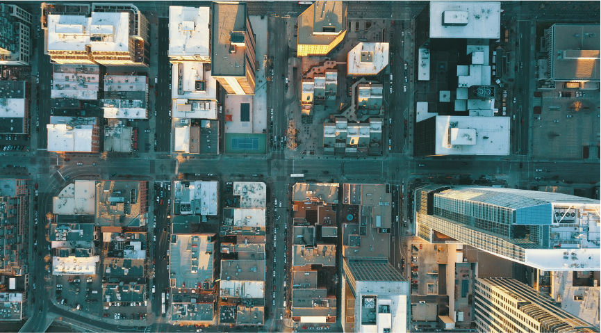
Do
Do use top down view of cities.
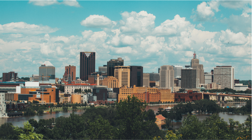
Don’t
Don’t use side shots of city.
Indoor Workspaces
Indoor workspaces are nature as we know it. These photos should only be of the spaces themselves without people in the shot. They should feel lived in and natural. They can be perfectly pristine or show recent signs of use, but shouldn’t feel staged. These photos should feel attainable, comfortable, and calming.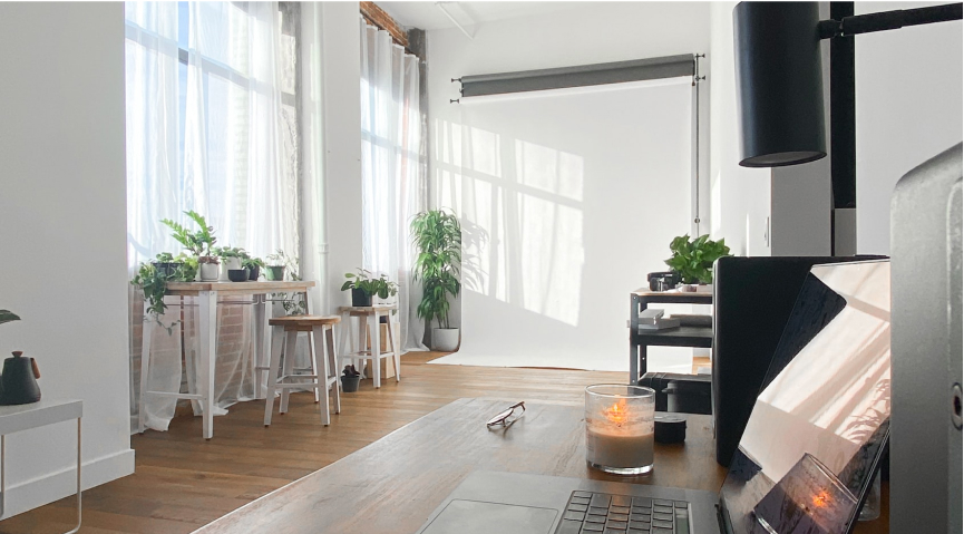
Do
Do select warm and inviting workspaces.

Don’t
Don’t use overly sterile workspaces.
Product
When photography is chosen to represent or accompany a product it should contain technical objects. These objects should tie directly into the product being sold or enhance the idea of the product.


Product Usage Guidelines
Vibrant Colors
For product images, use vibrant or neon colors. The colors should clearly pop and grab attention. The colors can directly tie to the product or be used to compliment the product.
Do
Do select vibrant or neon color photography

Don’t
Don’t use overly sterile workspaces.